jumbotrone-img

PUBLICATIONS

jumbotrone-img-mobile

PUBLICATIONS

contenuto-img1

 A two-volume boxed set, 350 pages on Easter rites and patron saint festivals from Gargano to Salento. A copy at the Quirinale. Editrice L'Immagine, 2016.


In 2016 the President of the Italian Republic, Sergio Mattarella, requested a copy of this work, through the regional councillor Loredana Capone. A two-volume boxed set, printed in a limited edition, which reached the Quirinale as a symbol of Apulia's cultural value.


It is an editorial work in two volumes, 350 colour pages, published by Editrice L'Immagine, documenting the Easter rites and patron saint festivals of Apulia from Gargano to Salento. The first volume is dedicated to the Easter rites, the second to the patron saint feast. Two faces of the same region, the sacred of the Holy Week processions and the profane that erupts in the village festivals.


Each section recounts the rites of a specific territory, with photographs and texts that place their historical, spiritual and identity meaning in context. The texts are by several authors, a choral work that holds different voices together on a subject that changes from town to town.


My work was to gather and select all the material, the photographs and the texts. In a work covering the entire region, choosing what goes in and what stays out is the part that decides the shape of the book. I worked on the accumulation of years of documentation, keeping what told a tradition from within and leaving out everything else.


A work like this is not leafed through quickly. The boxed set, the limited edition, the 350 pages serve to say one thing, that certain traditions deserve an object worthy of what they recount. The Apulia of the sacred and the profane is not brochure material.

contenuto-img1

MOLFETTAEXPORT.COM, the company profile of 69 businesses in the Molfetta industrial area, by Gaetano Armenio, 2015


Sixty-nine companies in the Molfetta industrial area shared one problem. Each of them knew its own trade, but none had a way to present itself alongside the others, at trade fairs, in front of a buyer who arrived from elsewhere and did not know the territory. I thought they needed a single object, something to place in the hands of anyone looking for suppliers.

The result was the company profile of MOLFETTAEXPORT.COM, 180 colour pages, bilingual Italian and English. A presentation tool for the MOLFETTAEXPORT.COM project, not just another catalogue.


The real problem was not photographing the companies. It was ordering them. Sixty-nine businesses ranging from mechanics to furniture, from services to transport, if you line them up at random no one finds their way. I organised them into eight macro categories covering around twenty sectors, so that anyone leafing through finds companies from the same field together and gets their bearings in seconds. Each company with its photographic profile and its list of competences.


I handled the editorial project, the photographs, the graphic design and the layout of the entire volume. It was distributed free at the main trade fairs in Italy and abroad, where a company profile done well is worth more than a business card.


Presenting a territory is not adding up the companies inside it. It is finding the order that makes them legible to someone who does not know them. Sixty-nine businesses become one single reality only when someone decides how to look at them.

contenuto-img1

Patroni di Puglia, the guide to patron saint festivals in 32 Apulian towns, design by Gaetano Armenio, 2012


In 2011 I built a guide for thirty-two towns on my own. One person, thirty-two administrations, a territory stretching from Gargano to Salento. Put that way it sounds like a mismatch, and in part it was.

It is the official publication of Patroni di Puglia, the first brand dedicated to Apulian patron saint festivals organised by type. A bilingual pocket guide in Italian and English, 160 colour pages, distributed free at international tourism fairs and to the 32 member towns.


The problem was not gathering the festivals. It was ordering them so an outsider could understand them. I divided them by type, the triumphal floats, the fireworks, the historical processions, the pilgrimages, the sea festivals. Each festival with its own profile, the practical information for anyone who wants to be there, and the hospitality standards agreed among the towns, because a festival is one thing and being ready to welcome those who arrive from elsewhere is another.

The bilingual format is not a whim. It brings the village festival to people who speak other languages, without dimming it into brochure translation. Editorial project, text, photographs, graphic design and layout I carried through on my own, from the first photograph to the last line.


A patron saint festival is not a calendar event. It is the way a town tells its own story once a year. Putting thirty-two of them in the same book without flattening them meant respecting, in each one, what makes it different from the others.

 
contenuto-img1

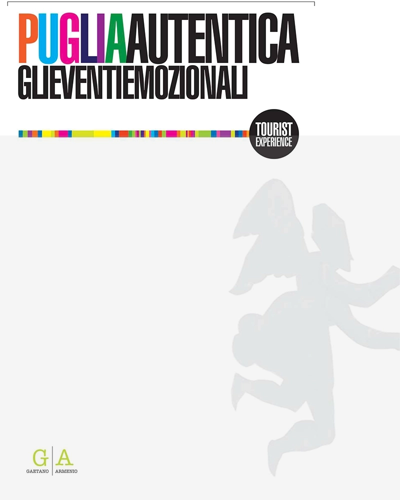
Pugliautentica, sixty pages on emotional and sustainable tourism in Apulia, by Gaetano Armenio, 2013


I wrote and published sixty pages to say something simple, that Apulia is not only beaches. A colour pamphlet, in Italian, born from an idea that did not yet have a name.

Looking at it today, it is one of the first documents in which my idea of emotional and sustainable tourism takes shape, the one that a year later would become the Associazione Pugliautentica. Back then it was a pamphlet. Later it became a network of people and towns.

Inside I put the Easter rites, the patron saint festivals, the spiritual paths, the places of worship. Not as a postcard, but as gateways to Apulian identity. The region's tangible and intangible heritage told as a resource for anyone looking for a real journey, not just another holiday. Text, photographs, graphic design and layout I handled alone, one by one.

It took a year for those sixty pages to find their legs. An idea put down on paper stays still until someone decides to turn it into work. In 2013 I did not know it yet, but that pamphlet was already the project that would come afterwards.

contenuto-img1

Pasqua in Puglia, the guide to Holy Week rites in twenty Apulian towns, design by Gaetano Armenio


I put Apulian Holy Week into travellers' pockets: not a book for the bedside table, a guide to carry with you at night, while the processions actually pass by.

I built it on foot. I went to twenty towns, from Gargano to Salento, to see with my own eyes the night processions, the hooded confraternities, the troccolanti (rattle-bearers), the perdoni (pilgrims of pardon), the Baroque Mysteries. I also put in the cuddhura and the scarcella, the traditional Easter breads, because in Apulia Easter is lived at the table as much as in the street, and a guide that forgets this tells only half the feast.


The result was a pocket guide of 170 colour pages, in Italian, English and German. The small format is not a whim, it is the function: anyone who wants to follow those processions, not just read about them, needs practical information within reach while walking in the dark.


The real problem was order. Twenty towns, dozens of rites, dates that change every year. I organised everything by province, with maps, updated dates of the celebrations, the historical and artistic profiles of the main devotions, and the itineraries. Photographs, text, graphic design and layout I handled alone, one by one.


A procession cannot be explained from outside. You understand it only if you are there, at night, while it passes. That guide was not meant to describe Holy Week. It was meant to accompany anyone who had decided to live it.


contenuto-img1

Sancta, places of the soul, 80 bilingual pages on religious tourism in Apulia, graphic design and photography by Gaetano Armenio


The Apulian places of the soul to Rome, in front of people who make religious tourism their trade. At the JOSP Fest, the Festival of the Itineraries of the Spirit run by the Opera Romana Pellegrinaggi, Apulia could not present itself with just any brochure. It had to speak the language of the operators, Italian and international, who decide where to send pilgrims.

For this I produced an 80-page colour magazine, bilingual Italian and English, for the SANCTA The Places of the Soul project. Not a catalogue of places, a tool made for an audience that buys and sells travel.


Inside is the Apulian spiritual heritage told through images and words, the churches, the abbeys, the sanctuaries, the processional rites of Holy Week and the patron saint festivals, the places of the soul from Gargano to Salento.


Each section is an itinerary in its own right, built around a devotional theme or a specific territory. Not a list, a route that has a direction. Editorial project, text, photographs, graphic design and layout I handled alone, one by one.


Presenting a region to those who sell journeys for a living is different from telling it to a tourist. The operator does not look for the postcard, he looks for the substance, the reason he should bring his pilgrims precisely there. That magazine had to give him that reason in eighty pages.